
Great Lakes Aquatic Nonindigenous Species Information System
Preserving and protecting the Great Lakes ecosystem against invasive species
Role
UX/UI Designer
Timeline
4 weeks
Team
Solo
Tools
Figma
Summary
During the Fall 2023 semester, UMSI, the University of Michigan School of Information, implemented a water-themed semester. Because of that, my Intro to UX class had the opportunity to partner with GLANSIS, a NOAA interagency, to redesign their website. GLANSIS is the Great Lakes Aquatic Nonindigenous Species Information System, a database with information about aquatic nonindigenous species specific to the Great Lakes. During the semester, I was able to work solo to redesign parts of the GLANSIS website, receiving recognition as one of the top 5 best designs in a class of over 100 talented students.
Project Goal
To redesign the GLANSIS website to improve the user experience, focusing on the species list generator page.
GLANSIS offers different tools on their website, so all students were given the chance to decide which tool to focus on.
Research Phase
To start the project, I analyzed the GLANSIS website to identify its main problems. Later, I gained access to previously conducted research materials, which included reports of needs assessments, interviews, usability testing, and heuristics evaluations.
After exploring the reports, I confirmed the three major problems I had initially identified with my analysis.
Lack of hierarchy
There was no clear hierarchy on both the homepage and the website as a whole.
information overload
A lot of information was being presented at once with no distinction.
Counterintuitive Designs
Counterintuitive designs were implemented through different areas of the website.
Understanding the problem statement
Access to the information on the GLANSIS website is vital in preserving the Great Lakes and its surrounding communities.
However, GLANSIS users struggle to navigate the website, often feeling lost, confused, and overwhelmed when trying to find and understand the information on the pages.
This prevents the users from gaining valuable insights, disturbing effective decision-making, and ultimately impacting the collective efforts towards conserving the Great Lakes ecosystem.
Design Phase
During the design process, I focused on:
- Creating a logical hierarchy for the homepage and website navigation.
- Reorganizing and sectioning the content on the pages and the list generator form.
- Strategizing how to present large amounts of information while still emphasizing the essential.
- Building meaningful consistency throughout the website.
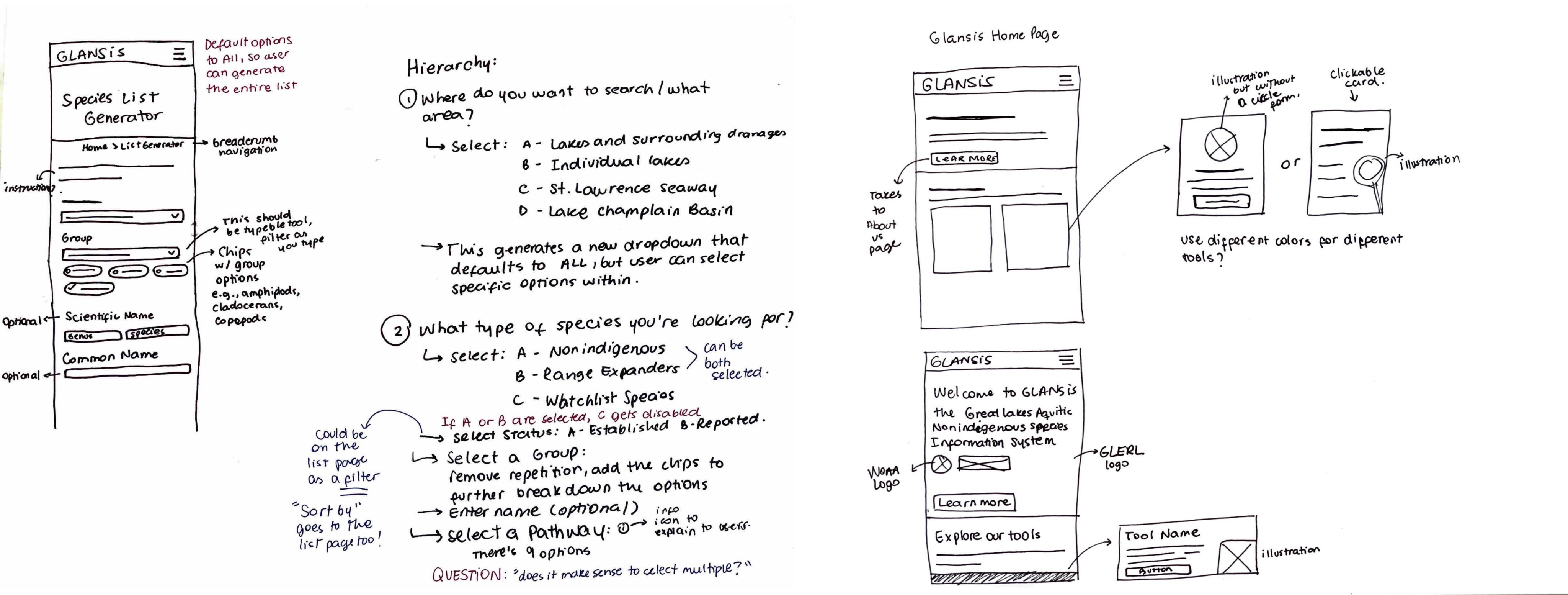
Key design decisions
After one round of mobile wireframing, I started embrace these 3 key design decisions to successfully address the problems

Typography & Color
Incorporate an effective typographic hierarchy and color solution.

Meaningful Text
Add instructional, clarifying content.

Cohesive Structural Diversity
Include specific UI elements such as cards, tabs, breadcrumbs, and chips.
Understanding Key Design Decisions
Typography & Color: Incorporating an effective typographic hierarchy and color solution
By creating a hierarchy using typography and color, the users are subconsciously informed of what to focus on. This also allows them to quickly scan the pages.
Meaningful Text: Adding instructional, clarifying content
Adding content that explains to the user what to expect, how to use a given feature, or what is being displayed on the screen helps mitigate feelings of confusion and disorientation.
Cohesive Structural Diversity: Including UI elements such as cards, tabs, breadcrumbs, and chips/tags
Employing card elements and tabs enabled efficient organization and segmentation of the extensive content on the website. This minimizes the need for prolonged scrolling, facilitating users in locating the information they seek with greater ease.
The breadcrumb elements present the structural hierarchy of the website to users and provide them with an additional mean to navigate between pages.
While tags emphasize and categorize information, chips were employed to empower users with greater control, facilitating their interaction with the data on the pages.
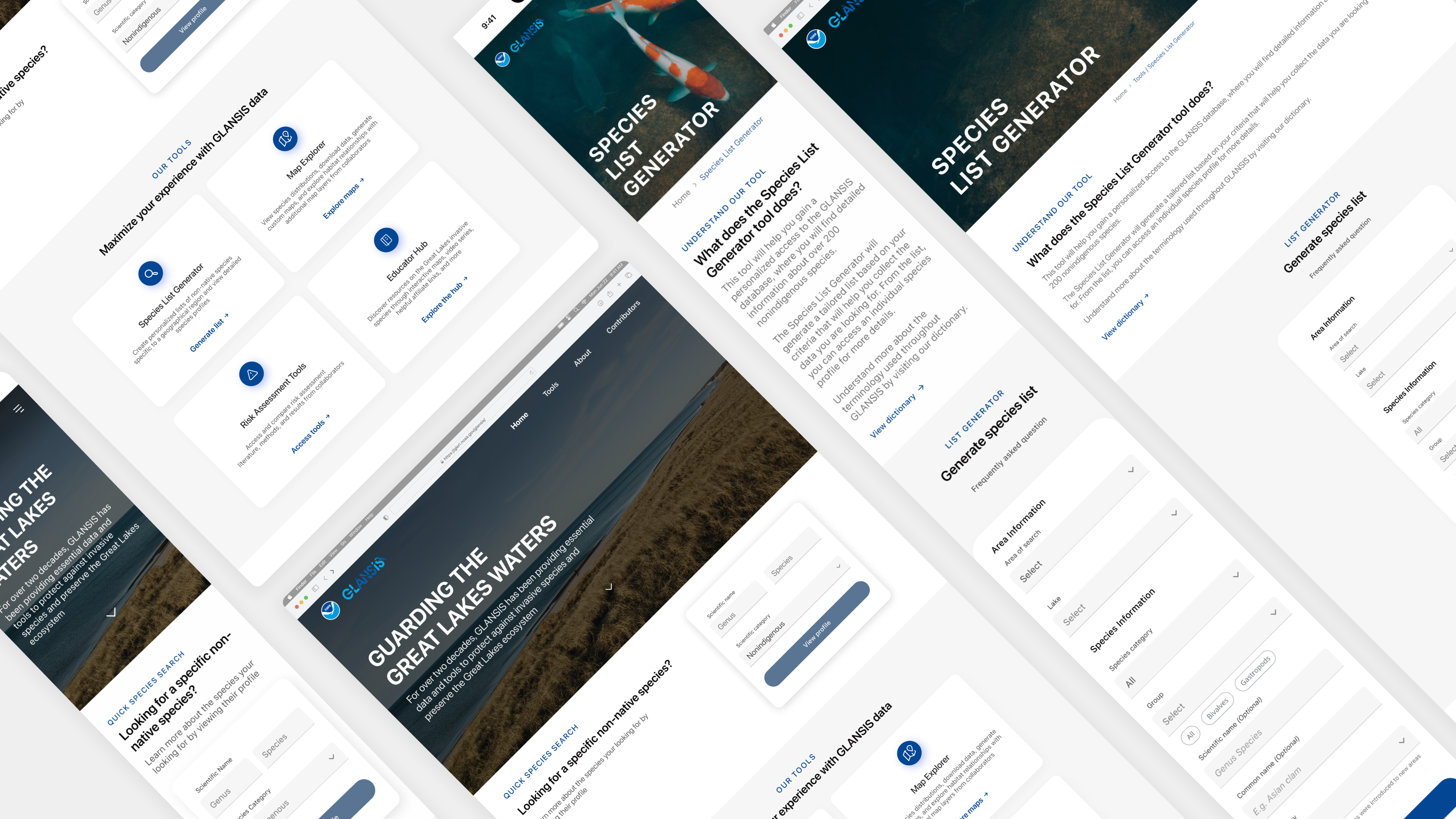
Final Designs
High-fidelity prototype
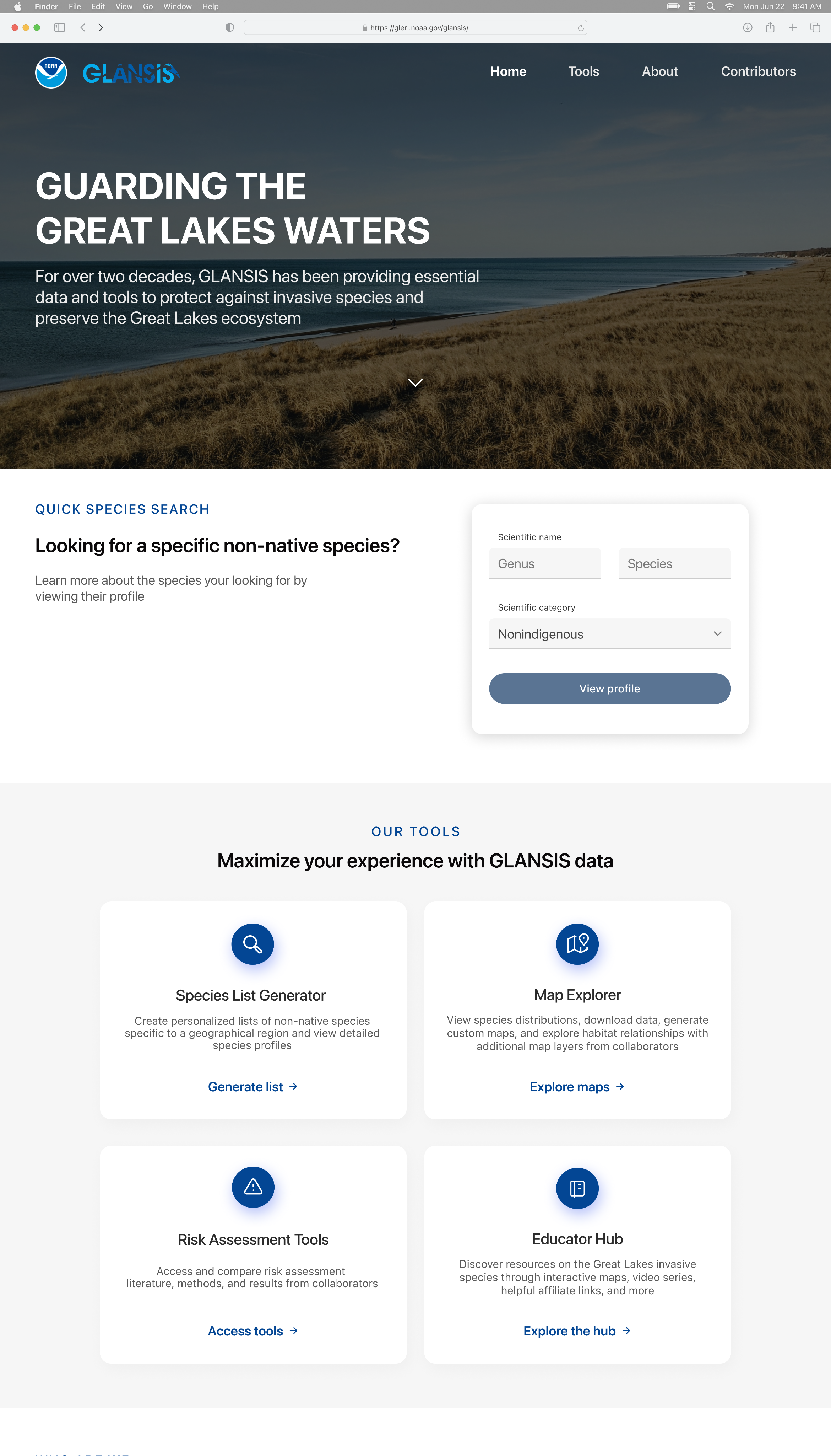
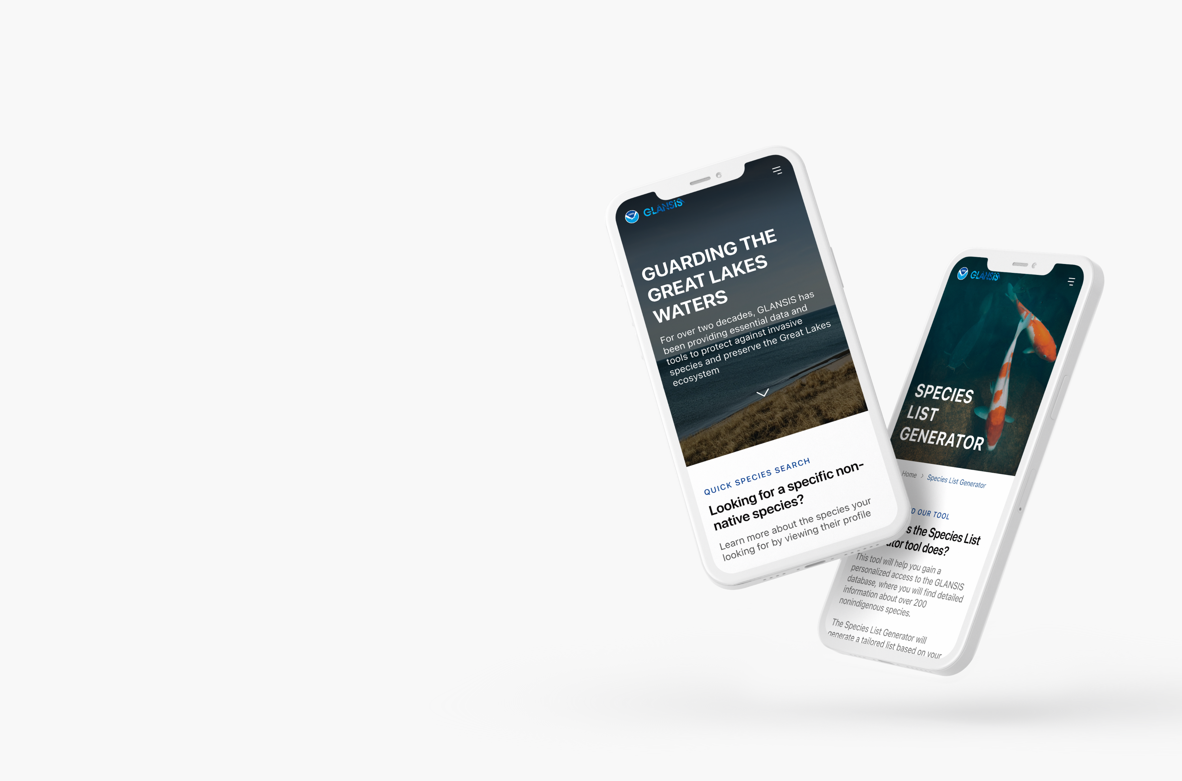
Homepage
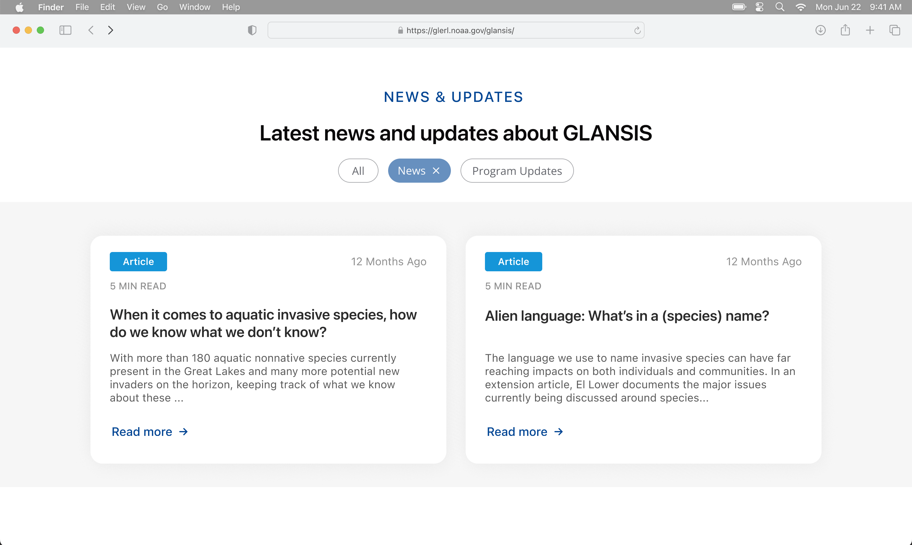
I incorporated new sections to the homepage to create a more complete experience for both new and recurring users. With this page, users should be able to familiarize themselves with GLANSIS, access the main tools, and access information more quickly.
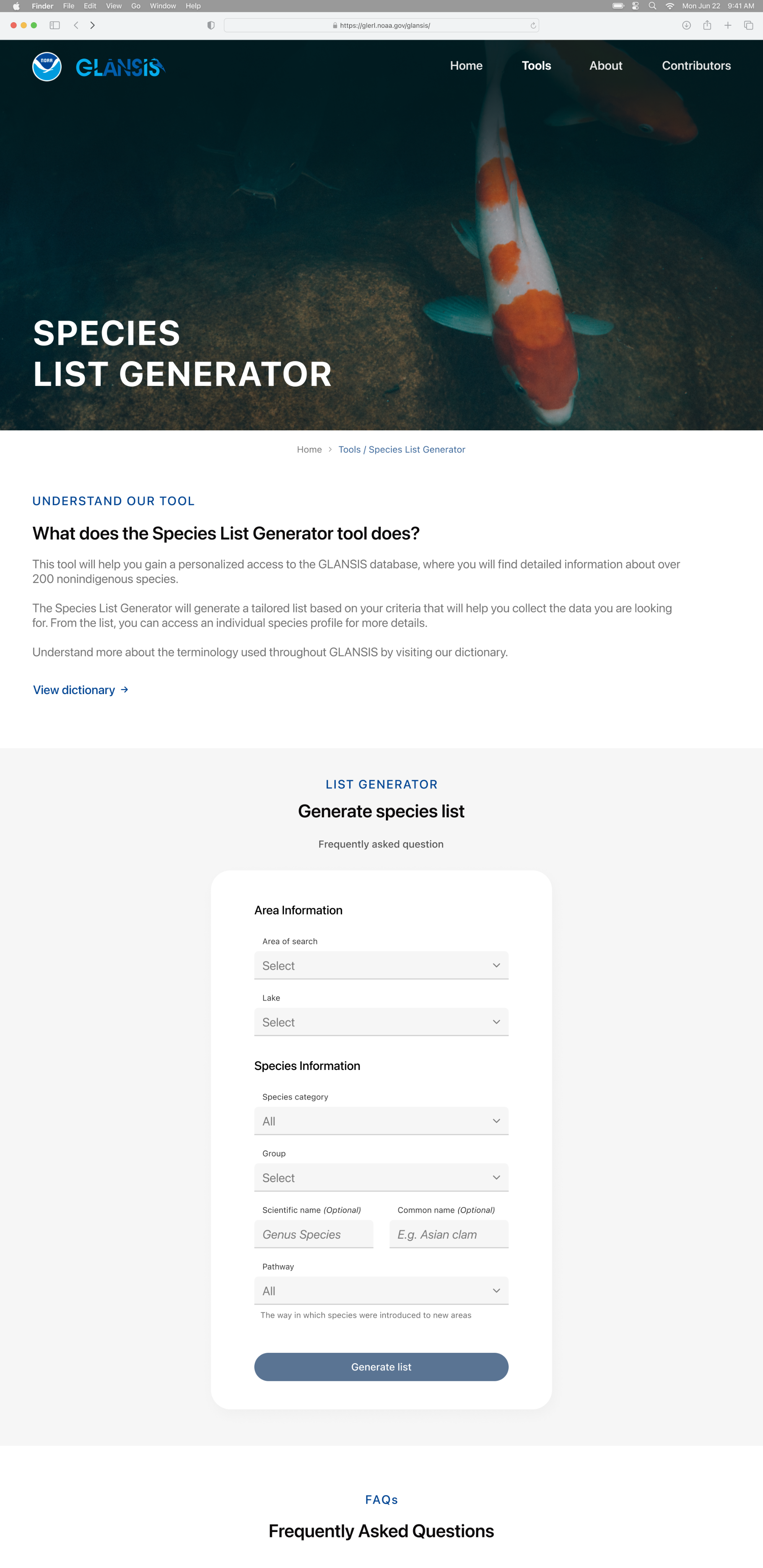
Species List Generator
I removed redundant fields and reorganized the form, creating sections, to help users fill in the information in a more intuitive way and faster.
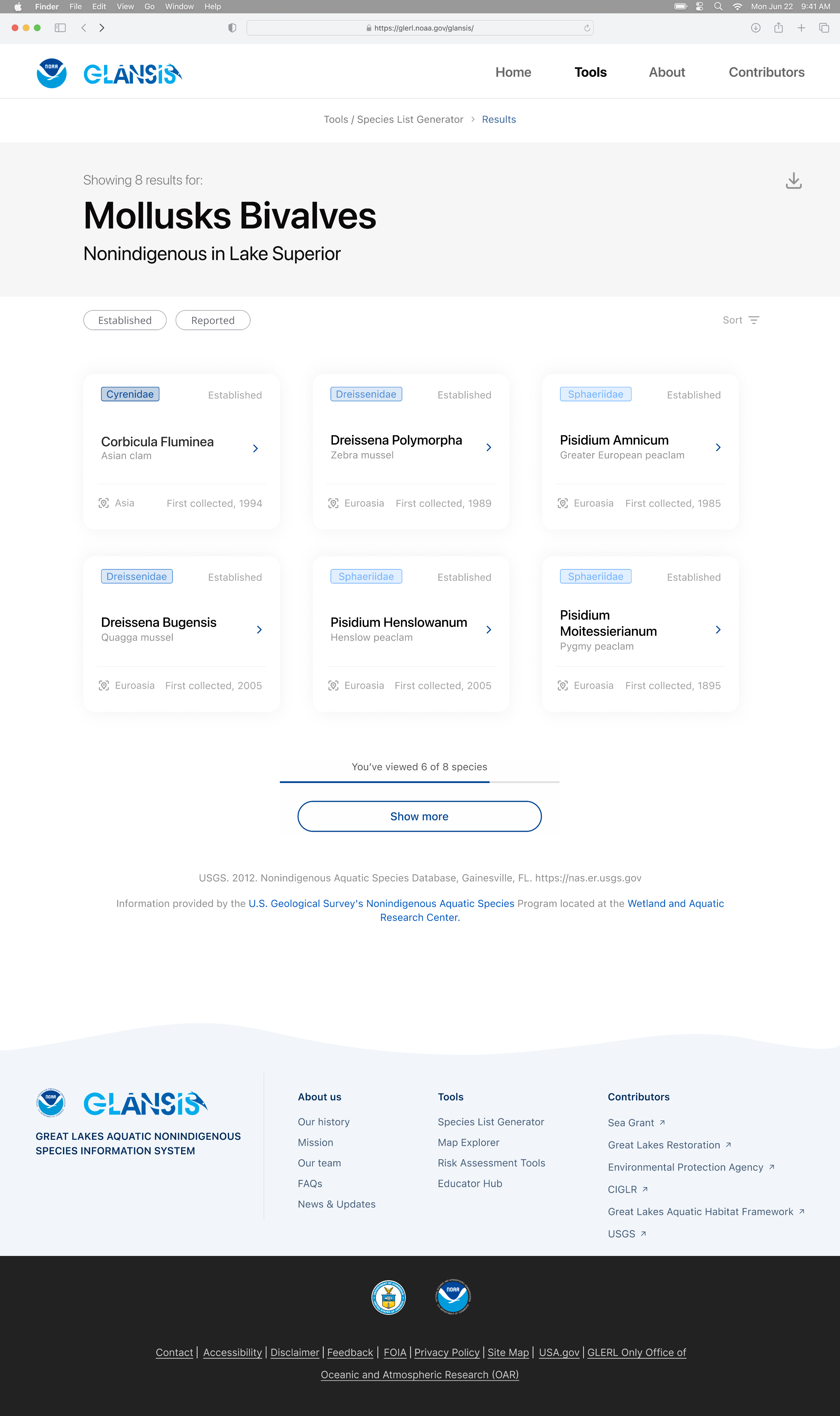
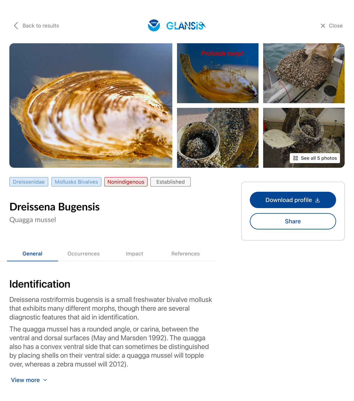
Species Results & Profile
I sectioned and reduced the initial amount of information being presented to the user on the species profile by making use of “tabs,” and was able to display all the information users might be looking for on a list by using cards, tags, and an effective typographic hierarchy.
Great Lakes Aquatic Nonindigenous Species Information System
Preserving and protecting the Great Lakes ecosystem against invasive species
Role
UX/UI Designer
Timeline
4 weeks
Team
Solo
Tools
Figma
Summary
During the Fall 2023 semester, UMSI, the University of Michigan School of Information, implemented a water-themed semester. Because of that, my Intro to UX class had the opportunity to partner with GLANSIS, a NOAA interagency, to redesign their website. GLANSIS is the Great Lakes Aquatic Nonindigenous Species Information System, a database with information about aquatic nonindigenous species specific to the Great Lakes. During the semester, I was able to work solo to redesign parts of the GLANSIS website, receiving recognition as one of the top 5 best designs in a class of over 100 talented students.
Project Goal
To redesign the GLANSIS website to improve the user experience, focusing on the species list generator page.
GLANSIS offers different tools on their website, so all students were given the chance to decide which tool to focus on.
Research Phase
To start the project, I analyzed the GLANSIS website to identify its main problems. Later, I gained access to previously conducted research materials, which included reports of needs assessments, interviews, usability testing, and heuristics evaluations.
After exploring the reports, I confirmed the three major problems I had initially identified with my analysis.
Lack of hierarchy
There was no clear hierarchy on both the homepage and the website as a whole.
information overload
A lot of information was being presented at once with no distinction.
Counterintuitive Designs
Counterintuitive designs were implemented through different areas of the website.
Understanding the problem statement
Access to the information on the GLANSIS website is vital in preserving the Great Lakes and its surrounding communities.
However, GLANSIS users struggle to navigate the website, often feeling lost, confused, and overwhelmed when trying to find and understand the information on the pages.
This prevents the users from gaining valuable insights, disturbing effective decision-making, and ultimately impacting the collective efforts towards conserving the Great Lakes ecosystem.
Design Phase
During the design process, I focused on:
- Creating a logical hierarchy for the homepage and website navigation.
- Reorganizing and sectioning the content on the pages and the list generator form.
- Strategizing how to present large amounts of information while still emphasizing the essential.
- Building meaningful consistency throughout the website.
Key design decisions
After one round of mobile wireframing, I started embrace these 3 key design decisions to successfully address the problems
Typography & Color
Incorporate an effective typographic hierarchy and color solution.
Meaningful Text
Add instructional, clarifying content.
Cohesive Structural Diversity
Include specific UI elements such as cards, tabs, breadcrumbs, and chips.
Understanding Key Design Decisions
Typography & Color: Incorporating an effective typographic hierarchy and color solution
By creating a hierarchy using typography and color, the users are subconsciously informed of what to focus on. This also allows them to quickly scan the pages.
Meaningful Text: Adding instructional, clarifying content
Adding content that explains to the user what to expect, how to use a given feature, or what is being displayed on the screen helps mitigate feelings of confusion and disorientation.
Cohesive Structural Diversity: Including UI elements such as cards, tabs, breadcrumbs, and chips/tags
Employing card elements and tabs enabled efficient organization and segmentation of the extensive content on the website. This minimizes the need for prolonged scrolling, facilitating users in locating the information they seek with greater ease.
The breadcrumb elements present the structural hierarchy of the website to users and provide them with an additional mean to navigate between pages.
While tags emphasize and categorize information, chips were employed to empower users with greater control, facilitating their interaction with the data on the pages.
Final Designs
High-fidelity prototype
Homepage
I incorporated new sections to the homepage to create a more complete experience for both new and recurring users. With this page, users should be able to familiarize themselves with GLANSIS, access the main tools, and access information more quickly.
Species List Generator
I removed redundant fields and reorganized the form, creating sections, to help users fill in the information in a more intuitive way and faster.
Species Results & Profile
I sectioned and reduced the initial amount of information being presented to the user on the species profile by making use of “tabs,” and was able to display all the information users might be looking for on a list by using cards, tags, and an effective typographic hierarchy.
Great Lakes Aquatic Nonindigenous Species Information System
Preserving and protecting the Great Lakes ecosystem against invasive species
Role
UX/UI Designer
Timeline
4 weeks
Team
Solo
Tools
Figma
Summary
During the Fall 2023 semester, UMSI, the University of Michigan School of Information, implemented a water-themed semester. Because of that, my Intro to UX class had the opportunity to partner with GLANSIS, a NOAA interagency, to redesign their website. GLANSIS is the Great Lakes Aquatic Nonindigenous Species Information System, a database with information about aquatic nonindigenous species specific to the Great Lakes. During the semester, I was able to work solo to redesign parts of the GLANSIS website, receiving recognition as one of the top 5 best designs in a class of over 100 talented students.
Project Goal
To redesign the GLANSIS website to improve the user experience, focusing on the species list generator page.
GLANSIS offers different tools on their website, so all students were given the chance to decide which tool to focus on.
Research Phase
To start the project, I analyzed the GLANSIS website to identify its main problems. Later, I gained access to previously conducted research materials, which included reports of needs assessments, interviews, usability testing, and heuristics evaluations.
After exploring the reports, I confirmed the three major problems I had initially identified with my analysis.
Understanding the problem statement
Access to the information on the GLANSIS website is vital in preserving the Great Lakes and its surrounding communities.
However, GLANSIS users struggle to navigate the website, often feeling lost, confused, and overwhelmed when trying to find and understand the information on the pages.
This prevents the users from gaining valuable insights, disturbing effective decision-making, and ultimately impacting the collective efforts towards conserving the Great Lakes ecosystem.
Lack of hierarchy
There was no clear hierarchy on both the homepage and the website as a whole.
information overload
A lot of information was being presented at once with no distinction.
Counterintuitive Designs
Counterintuitive designs were implemented through different areas of the website.
Design Phase
During the design process, I focused on:
- Creating a logical hierarchy for the homepage and website navigation.
- Reorganizing and sectioning the content on the pages and the list generator form.
- Strategizing how to present large amounts of information while still emphasizing the essential.
- Building meaningful consistency throughout the website.
Key design decisions
After one round of mobile wireframing, I started embrace these 3 key design decisions to successfully address the problems
Typography & Color
Incorporate an effective typographic hierarchy and color solution.

Meaningful Text
Add instructional, clarifying content.
Cohesive Structural Diversity
Include specific UI elements such as cards, tabs, breadcrumbs, and chips.
Understanding Key Design Decisions
Typography & Color: Incorporating an effective typographic hierarchy and color solution
By creating a hierarchy using typography and color, the users are subconsciously informed of what to focus on. This also allows them to quickly scan the pages.
Meaningful Text: Adding instructional, clarifying content
Adding content that explains to the user what to expect, how to use a given feature, or what is being displayed on the screen helps mitigate feelings of confusion and disorientation.
Cohesive Structural Diversity: Including UI elements such as cards, tabs, breadcrumbs, and chips/tags
Employing card elements and tabs enabled efficient organization and segmentation of the extensive content on the website. This minimizes the need for prolonged scrolling, facilitating users in locating the information they seek with greater ease.
The breadcrumb elements present the structural hierarchy of the website to users and provide them with an additional mean to navigate between pages.
While tags emphasize and categorize information, chips were employed to empower users with greater control, facilitating their interaction with the data on the pages.
Final Designs
High-fidelity prototype
Homepage
I incorporated new sections to the homepage to create a more complete experience for both new and recurring users. With this page, users should be able to familiarize themselves with GLANSIS, access the main tools, and access information more quickly.
Species List Generator
I removed redundant fields and reorganized the form, creating sections, to help users fill in the information in a more intuitive way and faster.
Species Results & Profile
I sectioned and reduced the initial amount of information being presented to the user on the species profile by making use of “tabs,” and was able to display all the information users might be looking for on a list by using cards, tags, and an effective typographic hierarchy.