

PassiveBolt KeyShare
94% Faster Sign-In: Redesigning PassiveBolt KeyShare’s Onboarding Flow
Role
Project Manager
UX Design Lead
Timeline
8 months
Team
5 UX Designers
Tools
Figma
Miro
Summary
PassiveBolt focuses on decentralized identity solutions for secure access to spaces, primarily targeting the hospitality sector. Their primary product, KeyShare, aims to provide automation so hotels can serve more guests with fewer staff, as well as provide a seamless and fast guest access experience. Their desktop platform serves as a property management system, while the mobile version acts as a digital wallet.
The initial focus of the project was to uncover user pain points and identify opportunity for improvement within both mobile and desktop versions of the KeyShare platform. As a Project Manager and UX Lead consulting for PassiveBolt, I spearheaded a redesign of the KeyShare onboarding ecosystem. By bridging the gap between complex decentralized identity tech and the user needs, I led the team to transform a fragmented 15-minute sign-in process into a seamless 1-minute experience, increasing efficiency by 94%. My dual role involved stakeholder alignment and workshops while personally owning the design of the desktop sign-in and organization-joining flows.
The Problem
KeyShare enables secure access management for hotels, but users struggled to access and use essential platform functionality due to a complex onboarding workflow.
Usability testing revealed that different areas of the onboarding experience imposed unnecessary cognitive load on users, directly affecting both efficiency and trust in the system. For example, the desktop sign-in flow had a success rate of only 33.3%, with an average completion time of nearly 15 minutes. Users frequently experienced confusion, made errors, and expressed frustration throughout these workflows.
Project Goal
Our goal was to make KeyShare easier and more intuitive for users, ensuring that key workflows, such as account creation, identity verification, organization onboarding, and desktop sign-in could be completed with confidence and minimal errors.
Research Phase
During the research phase, we employed a combination of methods to evaluate the existing onboarding process and uncover key pain points, usability issues, and opportunities for improvement.
This included a heuristic evaluation of the platform to identify violations of established usability principles, as well as usability testing with new and current KeyShare users to observe where they struggled. This combination of methods allowed us to validate whether the identified issues actually impacted users’ experiences during real interactions with the system.
Key Findings
Contextual help & Error resolution
Users struggled in determining the significance of each step of the process and lacked a clear way resolving errors that arose within the workflow.
Unclearer terminology & Language misalignment
Much of the terminology within the platform lacked substantial meaning to users, diminishing its effectiveness at describing functionality.
Usability Testing
We conducted total of 6 usability testing sessions with the goal to understand the friction points within the different flows involved in onboarding the KeyShare platform, those being:
- Create a KeyShare account
- Verify your identify
- Join your work organization
- Access your work account on desktop
- Onboard new staff members
- Check-in a new hotel guest
We focused on gathering quantitative data such as task completion rates and time on task, as well as qualitative information like error patterns and the context behind these workflows, to gather relevant insights.
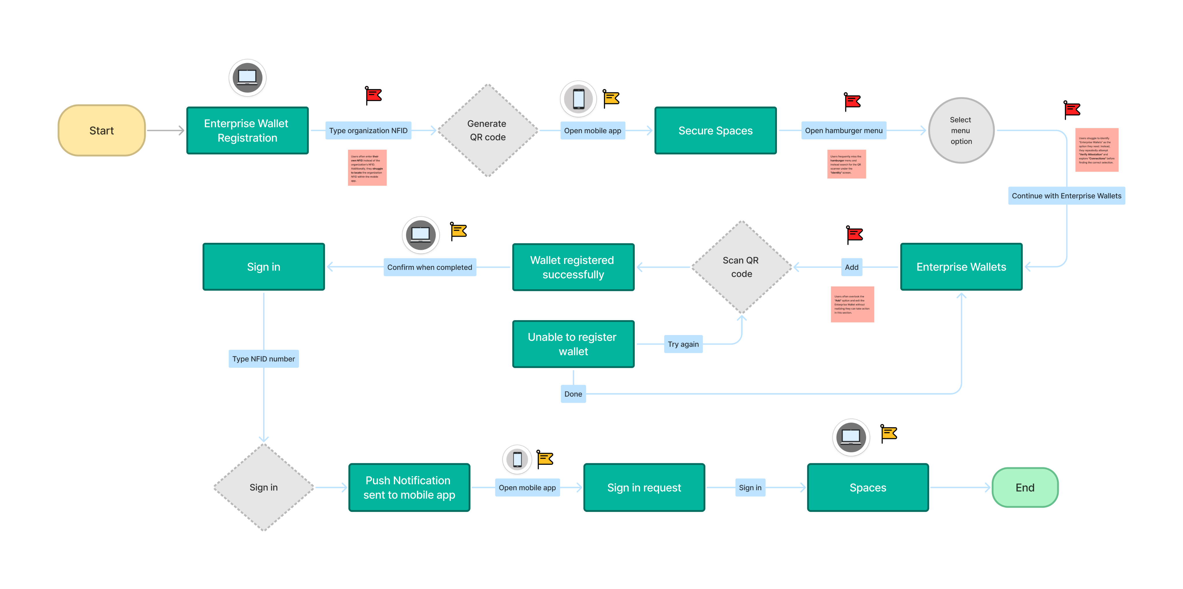
Results showed the most critical area of the onboarding process was the desktop sign-in. With a success rate of 33.3% and an average completion time of 14:54 minutes, users struggled to find critical features and understand the terminology and instructions throughout the process.
Desktop sign-in flow
As shown in the flow diagram below, the desktop sign-in process involves multiple steps, many of which caused confusion or errors among users.
Team Coordination & Flow Ownership
To address user pain points across all flows involved in the onboarding process, our team distributed design ownership by workflow, with each designer responsible for guiding design initiatives within a specific area. I took ownership of the join organization and desktop sign-in flows, while contributing to broader platform improvements, such as clarifying labels and reorganizing navigation, that supported the overall experience.
Design Phase
The design phase began with a collaborative brainstorming session where the team used the SCAMPER method, guided by ‘How Might We’ statements to ideate on KeyShare’s onboarding flows. After identifying the most promising ideas and evaluating them using an ‘Impact vs Feasibility’ framework, team members took ownership of specific workflows and independently explored, iterated, and refined solutions through sketches, wireframes, and early prototypes.
Join Organization Flow
The design phase began with a collaborative brainstorming session where the team used the SCAMPER method, guided by ‘How Might We’ statements to ideate on KeyShare’s onboarding flows. After identifying the most promising ideas and evaluating them using an ‘Impact vs Feasibility’ framework, team members took ownership of specific workflows and independently explored, iterated, and refined solutions through sketches, wireframes, and early prototypes.
Restructuring Navigation
Joining the work organization through the KeyShare mobile platform was an essential part of the onboarding process for new staff members of hotels.
Users struggled to find their organization invite because the existing design did not align with their mental model of where this information should live. To address this, I explored solutions that reorganized navigation, refined labels and reduced redundancy to make key actions easier to scan, understand, and differentiate, and increased the visibility of new invites to better capture users’ attention.
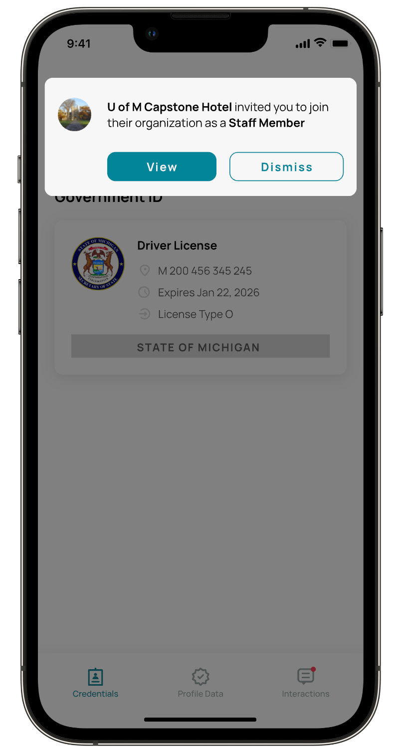
Increasing Organization Invite Visibility
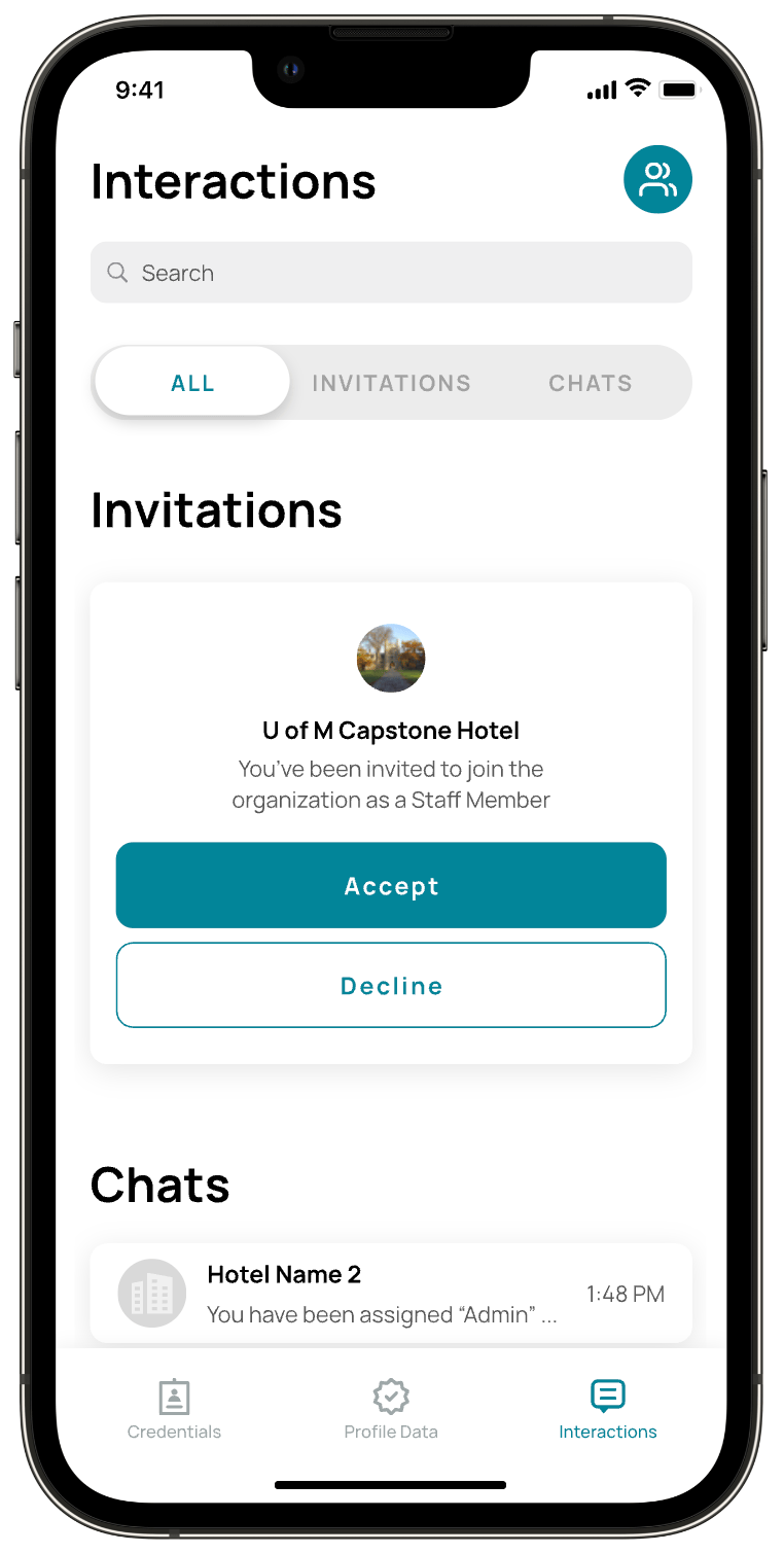
Research revealed that users often missed organization invites because the existing visual cue (a small red indicator within the Interactions tab) failed to capture their attention. To address this, I designed an in-app notification experience that clearly alerts users when a new organization invite is received and allows them to navigate directly to the invite to take action.
To maintain consistency within the platform, the solution was integrated into the existing ‘Interactions’ area and restructured to clearly differentiate chat messages from organization invites, reducing ambiguity and improving scanability. The notification directs users to the familiar ‘Join Organization’ flow, preserving the existing process while improving discoverability.
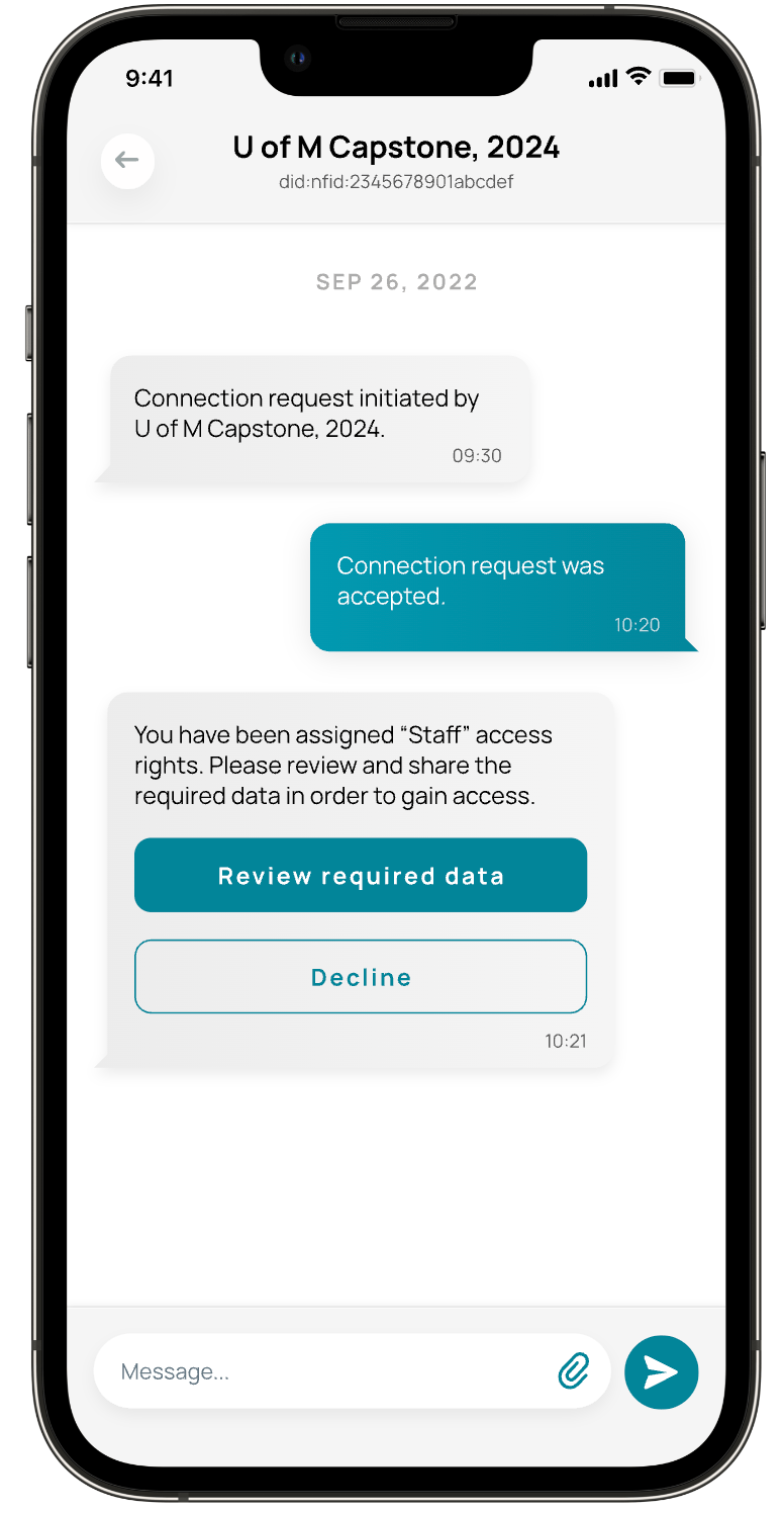
To further reduce confusion, I refined the language used throughout the flow to better reflect user expectations and added a confirmation message after an invite is accepted. This provided clear feedback at a critical moment, addressing a key usability issue identified during research: users were often unsure whether they had successfully joined an organization.
The redesigned ‘Join Organization’ flow reduced average task completion time by 65.1%,
(3:00 → 1:17 minutes) across 15 participants, while eliminating confusion around successful organization enrollment.
Desktop Sign-In Flow
In parallel with the ‘Join Organization’ flow, I explored improvements to the first-time desktop sign-in experience for staff onboarding to a new hotel. Working within existing technical constraints, the focus was on reducing the number of required steps, improving guidance throughout the process, and minimizing cognitive load to help users successfully access their work account faster and with confidence.
Sketching
Because users found the sign-in process overly complex, requiring them to manually enter two different 16-digit ID multiple times, I initially focused on how I could removed the need for this type of manual entry.
Given that a QR code interaction already existed, I designed a solution to expand the QR code’s utility so it could automate these complex data entries. I also introduced step-by-step guidance to reduce uncertainty, aiming to transform a complex credential process into a clear, guided experience.
Wireframing
While refining the expanded QR code solution and the supporting cross-platform interactions, I regularly sought feedback from peers, users, mentors, and the client. This iterative feedback loop guided several design iterations and helped validate decisions leading to the final solution.
Version 1
This iteration builds on KeyShare’s existing QR code flow, using a familiar streaming-style sign-in to reduce manual input and better guide first-time users.
To address user frustration around locating the QR code scanner, the design introduces a dedicated entry point tied to the user’s organization ID, along with a simplified 6-digit code as an accessible fallback when camera access is unavailable.
Version 2
Based on feedback, offering both QR code scanning and code entry risked creating conflicting mental models across devices. To reduce confusion and align with implementation constraints, the design pivoted to a single 6-digit code flow, which also addressed user concerns around camera use during work shifts and avoiding potential guest discomfort.
Version 3
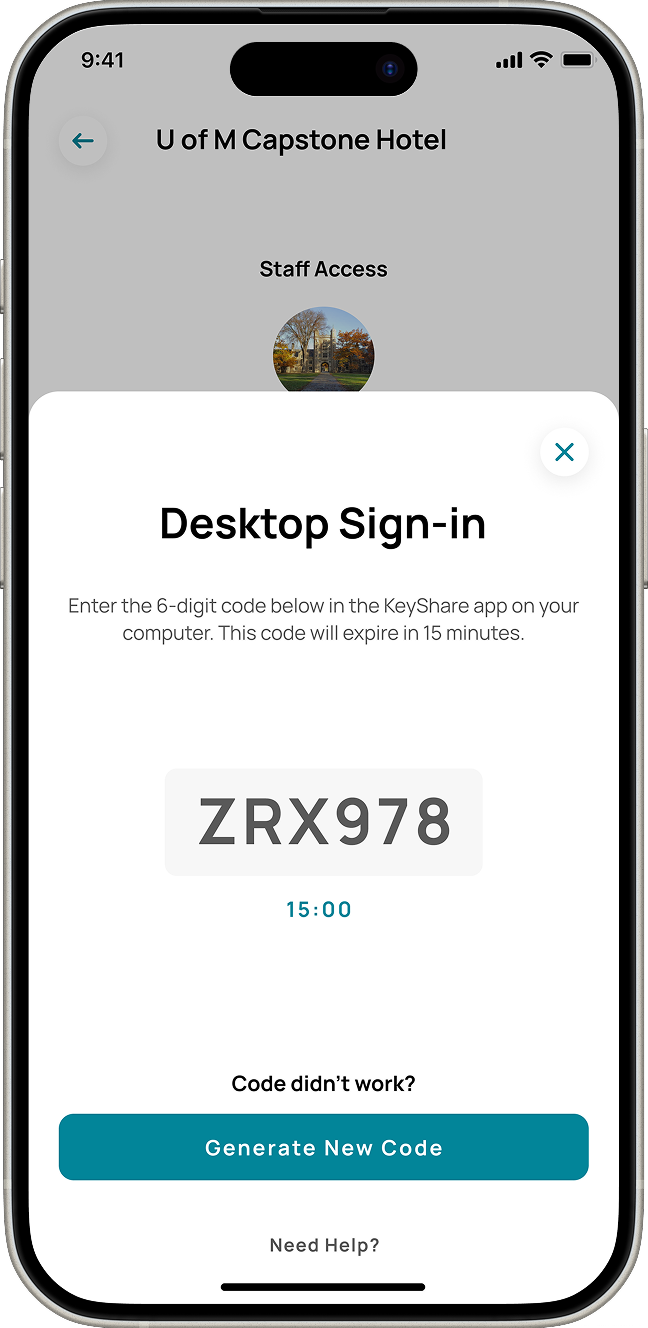
To reduce confusion, the split-screen layout presenting multiple sign-in options was removed, and a unique ‘first-time sign-in’ screen was introduced shown only to new users to reduce unnecessary decision-making on return visits. Additionally, a visible expiration timer was designed to prevent uncertainty during and allow users to complete sign-in with confidence.
Final Design
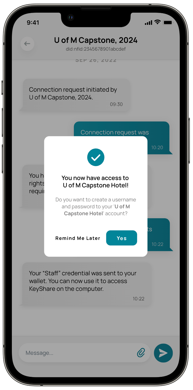
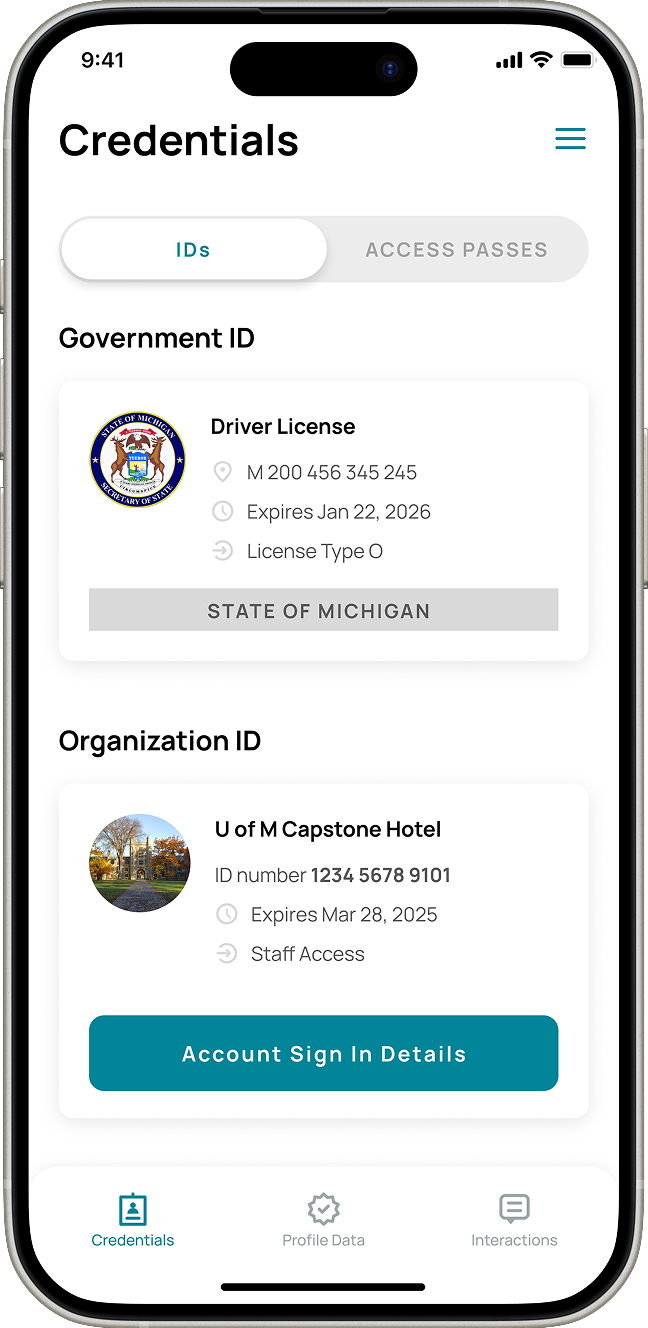
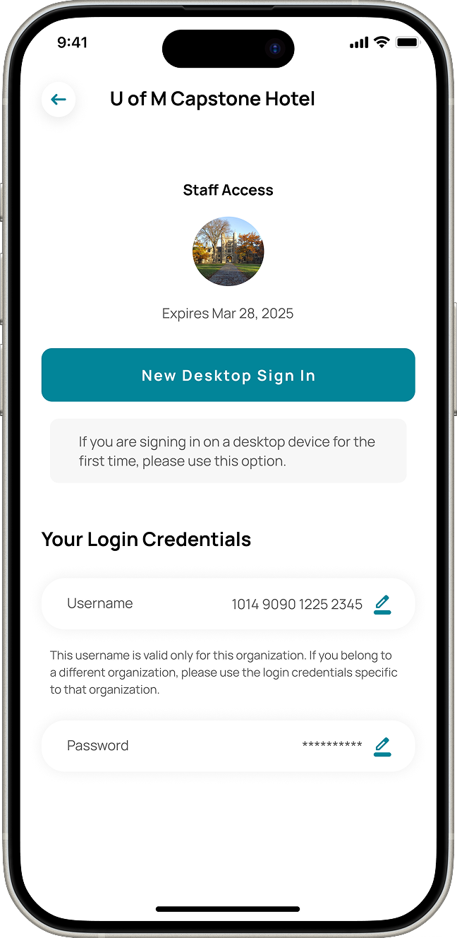
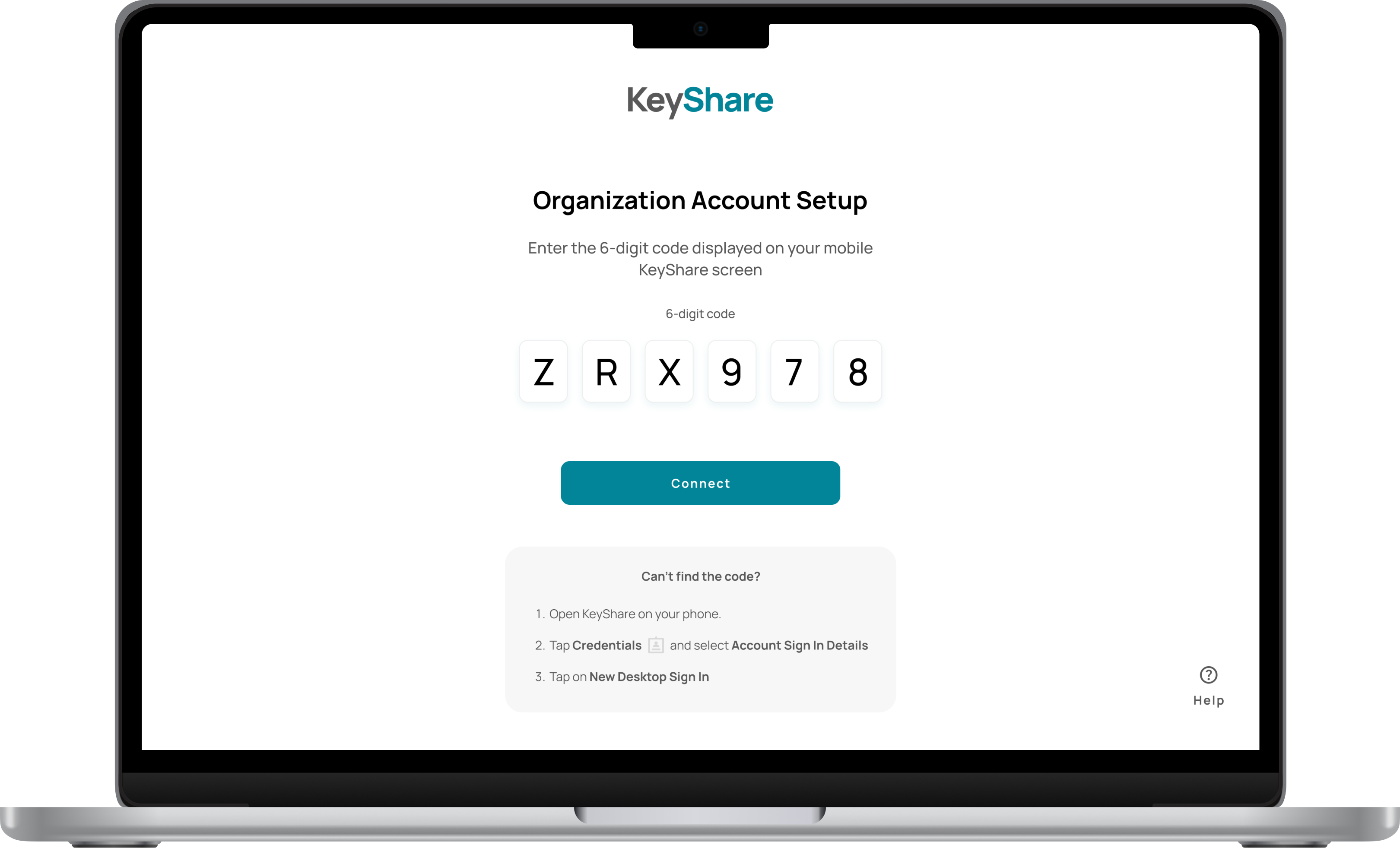
The desktop sign-in process was fully redesigned across both mobile and desktop apps to simplify first-time access. Users can now navigate to the new Credentials tab, where each joined organization displays an Account Sign-In Details button. Selecting this button opens a dedicated screen showing sign-in information for that organization. Now, users can view or set up their username and password, and generate a unique 6-digit code via New Desktop Sign-In. Entering this code on the desktop app links their organization account to the computer for the first time, streamlining onboarding while reducing errors and cognitive load.
The impact
94%
decrease in time spent for first time desktop sign in, going from 15 min to 57 sec
20/20
users expressed that it felt easy to complete the new onboarding process.
Desktop Sign-In in Action
Strategic Leadership & UX Outcomes
This project was my first and largest experience acting as both project manager and UX lead, and it taught me a great deal about balancing strategic direction with hands-on design work. I’m proud of how our team collaborated to make meaningful, platform-wide improvements — many beyond the flows highlighted in this case study.
By guiding ideation, research, and design across multiple workflows, I was able to drive the team toward solutions that not only addressed user pain points but also created a more intuitive and efficient experience across the platform. This experience reinforced the importance of clear communication, iterative problem-solving, and aligning UX strategy with team execution. I will continue to carry these lessons forward in every project I tackle.
PassiveBolt KeyShare
94% Faster Sign-In: Redesigning PassiveBolt KeyShare’s Onboarding Flow
Role
Project Manager
UX Design Lead
Timeline
8 months
Team
5 UX Designers
Tools
Figma
Miro
Summary
PassiveBolt focuses on decentralized identity solutions for secure access to spaces, primarily targeting the hospitality sector. Their primary product, KeyShare, aims to provide automation so hotels can serve more guests with fewer staff, as well as provide a seamless and fast guest access experience. Their desktop platform serves as a property management system, while the mobile version acts as a digital wallet.
The initial focus of the project was to uncover user pain points and identify opportunity for improvement within both mobile and desktop versions of the KeyShare platform. As a Project Manager and UX Lead consulting for PassiveBolt, I spearheaded a redesign of the KeyShare onboarding ecosystem. By bridging the gap between complex decentralized identity tech and the user needs, I led the team to transform a fragmented 15-minute sign-in process into a seamless 1-minute experience, increasing efficiency by 94%. My dual role involved stakeholder alignment and workshops while personally owning the design of the desktop sign-in and organization-joining flows.
The Problem
KeyShare enables secure access management for hotels, but users struggled to access and use essential platform functionality due to a complex onboarding workflow.
Usability testing revealed that different areas of the onboarding experience imposed unnecessary cognitive load on users, directly affecting both efficiency and trust in the system. For example, the desktop sign-in flow had a success rate of only 33.3%, with an average completion time of nearly 15 minutes. Users frequently experienced confusion, made errors, and expressed frustration throughout these workflows.
Project Goal
Our goal was to make KeyShare easier and more intuitive for users, ensuring that key workflows, such as account creation, identity verification, organization onboarding, and desktop sign-in could be completed with confidence and minimal errors.
Research Phase
During the research phase, we employed a combination of methods to evaluate the existing onboarding process and uncover key pain points, usability issues, and opportunities for improvement.
This included a heuristic evaluation of the platform to identify violations of established usability principles, as well as usability testing with new and current KeyShare users to observe where they struggled. This combination of methods allowed us to validate whether the identified issues actually impacted users’ experiences during real interactions with the system.
Key Findings
Contextual help & Error resolution
Users struggled in determining the significance of each step of the process and lacked a clear way resolving errors that arose within the workflow.
Unclearer terminology & Language misalignment
Much of the terminology within the platform lacked substantial meaning to users, diminishing its effectiveness at describing functionality.
Usability Testing
We conducted total of 6 usability testing sessions with the goal to understand the friction points within the different flows involved in onboarding the KeyShare platform, those being:
- Create a KeyShare account
- Verify your identify
- Join your work organization
- Access your work account on desktop
- Onboard new staff members
- Check-in a new hotel guest
We focused on gathering quantitative data such as task completion rates and time on task, as well as qualitative information like error patterns and the context behind these workflows, to gather relevant insights.
Results showed the most critical area of the onboarding process was the desktop sign-in. With a success rate of 33.3% and an average completion time of 14:54 minutes, users struggled to find critical features and understand the terminology and instructions throughout the process.
Desktop sign-in flow
As shown in the flow diagram below, the desktop sign-in process involves multiple steps, many of which caused confusion or errors among users.
Team Coordination & Flow Ownership
To address user pain points across all flows involved in the onboarding process, our team distributed design ownership by workflow, with each designer responsible for guiding design initiatives within a specific area. I took ownership of the join organization and desktop sign-in flows, while contributing to broader platform improvements, such as clarifying labels and reorganizing navigation, that supported the overall experience.
Design Phase
The design phase began with a collaborative brainstorming session where the team used the SCAMPER method, guided by ‘How Might We’ statements to ideate on KeyShare’s onboarding flows. After identifying the most promising ideas and evaluating them using an ‘Impact vs Feasibility’ framework, team members took ownership of specific workflows and independently explored, iterated, and refined solutions through sketches, wireframes, and early prototypes.
Join Organization Flow
The design phase began with a collaborative brainstorming session where the team used the SCAMPER method, guided by ‘How Might We’ statements to ideate on KeyShare’s onboarding flows. After identifying the most promising ideas and evaluating them using an ‘Impact vs Feasibility’ framework, team members took ownership of specific workflows and independently explored, iterated, and refined solutions through sketches, wireframes, and early prototypes.
Restructuring Navigation
Joining the work organization through the KeyShare mobile platform was an essential part of the onboarding process for new staff members of hotels.
Users struggled to find their organization invite because the existing design did not align with their mental model of where this information should live. To address this, I explored solutions that reorganized navigation, refined labels and reduced redundancy to make key actions easier to scan, understand, and differentiate, and increased the visibility of new invites to better capture users’ attention.
Increasing Organization Invite Visibility
Research revealed that users often missed organization invites because the existing visual cue (a small red indicator within the Interactions tab) failed to capture their attention. To address this, I designed an in-app notification experience that clearly alerts users when a new organization invite is received and allows them to navigate directly to the invite to take action.
To maintain consistency within the platform, the solution was integrated into the existing ‘Interactions’ area and restructured to clearly differentiate chat messages from organization invites, reducing ambiguity and improving scanability. The notification directs users to the familiar ‘Join Organization’ flow, preserving the existing process while improving discoverability.
To further reduce confusion, I refined the language used throughout the flow to better reflect user expectations and added a confirmation message after an invite is accepted. This provided clear feedback at a critical moment, addressing a key usability issue identified during research: users were often unsure whether they had successfully joined an organization.
The redesigned ‘Join Organization’ flow reduced average task completion time by 65.1%,
(3:00 → 1:17 minutes) across 15 participants, while eliminating confusion around successful organization enrollment.
Desktop Sign-In Flow
In parallel with the ‘Join Organization’ flow, I explored improvements to the first-time desktop sign-in experience for staff onboarding to a new hotel. Working within existing technical constraints, the focus was on reducing the number of required steps, improving guidance throughout the process, and minimizing cognitive load to help users successfully access their work account faster and with confidence.
Sketching
Because users found the sign-in process overly complex, requiring them to manually enter two different 16-digit ID multiple times, I initially focused on how I could removed the need for this type of manual entry.
Given that a QR code interaction already existed, I designed a solution to expand the QR code’s utility so it could automate these complex data entries. I also introduced step-by-step guidance to reduce uncertainty, aiming to transform a complex credential process into a clear, guided experience.
Wireframing
While refining the expanded QR code solution and the supporting cross-platform interactions, I regularly sought feedback from peers, users, mentors, and the client. This iterative feedback loop guided several design iterations and helped validate decisions leading to the final solution.
Version 1
This iteration builds on KeyShare’s existing QR code flow, using a familiar streaming-style sign-in to reduce manual input and better guide first-time users.
To address user frustration around locating the QR code scanner, the design introduces a dedicated entry point tied to the user’s organization ID, along with a simplified 6-digit code as an accessible fallback when camera access is unavailable.
Version 2
Based on feedback, offering both QR code scanning and code entry risked creating conflicting mental models across devices. To reduce confusion and align with implementation constraints, the design pivoted to a single 6-digit code flow, which also addressed user concerns around camera use during work shifts and avoiding potential guest discomfort.
Version 3
To reduce confusion, the split-screen layout presenting multiple sign-in options was removed, and a unique ‘first-time sign-in’ screen was introduced shown only to new users to reduce unnecessary decision-making on return visits. Additionally, a visible expiration timer was designed to prevent uncertainty during and allow users to complete sign-in with confidence.
Final Design
The desktop sign-in process was fully redesigned across both mobile and desktop apps to simplify first-time access. Users can now navigate to the new Credentials tab, where each joined organization displays an Account Sign-In Details button. Selecting this button opens a dedicated screen showing sign-in information for that organization. Now, users can view or set up their username and password, and generate a unique 6-digit code via New Desktop Sign-In. Entering this code on the desktop app links their organization account to the computer for the first time, streamlining onboarding while reducing errors and cognitive load.
The impact
94%
decrease in time spent for first time desktop sign in, going from 15 min to 57 sec
20/20
users expressed that it felt easy to complete the new onboarding process.
Desktop Sign-In in Action
Strategic Leadership & UX Outcomes
This project was my first and largest experience acting as both project manager and UX lead, and it taught me a great deal about balancing strategic direction with hands-on design work. I’m proud of how our team collaborated to make meaningful, platform-wide improvements — many beyond the flows highlighted in this case study.
By guiding ideation, research, and design across multiple workflows, I was able to drive the team toward solutions that not only addressed user pain points but also created a more intuitive and efficient experience across the platform. This experience reinforced the importance of clear communication, iterative problem-solving, and aligning UX strategy with team execution. I will continue to carry these lessons forward in every project I tackle.